jessiemar-portfolio
| home page | data viz examples | critique by design | final project I | final project II | final project III |
The Cheapest Countries to Study in Europe
In this critique, I apply principles from Good Charts and Stephen Few’s Data Visualization Effectiveness Profile to evaluate and redesign a visualization from the article “The Cheapest Countries to Study in Europe.” The original chart—a shaded map of Europe showing total yearly study costs—provides a clear geographic frame but leaves gaps in precision, completeness, and audience alignment. To strengthen the critique, I also incorporate feedback from audience interviews, which reveal how real users interpret, struggle with, or disengage from the design. By combining theoretical frameworks with external perspectives, I will break down the visualization step by step, highlighting design trade-offs, contextual limitations, and opportunities for improvement. My goal is to demonstrate how thoughtful redesign choices, informed by both expert guidance and user feedback, can transform the chart into a more accurate, engaging, and decision-oriented tool for students evaluating study-abroad options.
Step one: the visualization
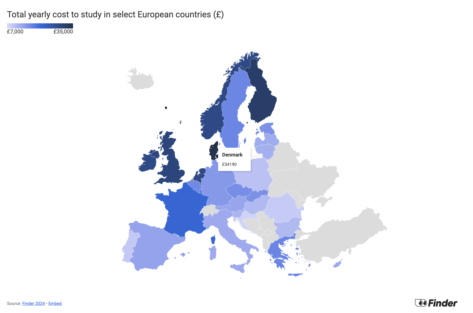
I selected this particular data visualization from the article “The Cheapest Countries to Study in Europe” because study-abroad costs are a pressing concern for many international students, and the visualization attempts to summarize complex financial data in a way that is approachable for a general audience. Its accessibility and practical focus make it an ideal case for critique, as the stakes are high—misleading or incomplete representations could directly influence how students perceive affordability across different countries. As someone currently studying in the United States, where both tuition and living expenses are notably high, I am also curious to see how the costs of studying in Europe compare. This personal perspective makes the visualization especially relevant and engaging to analyze.
Citation: Boyle, Matthew, and Sophie Barber. “The Cheapest Countries to Study in Europe.” Finder UK. Updated July 11, 2024. Accessed September 17, 2025. https://www.finder.com/uk/current-accounts/student-bank-accounts/cheapest-countries-to-study-europe
Step two: the critique
1. First Impressions & Design Strengths
- The visualization uses a map of Europe with a gradient legend to show total yearly study costs.
- The geographic framing is intuitive—audiences immediately connect the shading to cost differences across countries.
- The title is clear and aligned with the data, making the visualization accessible and easy to read.
2. Simplicity and Engagement
The color gradient (darkest blue = highest cost, lightest = lowest) keeps the design simple and easy to interpret. However, this simplicity also creates drawbacks:
- It is difficult to compare countries precisely or rank them by cost.
- Once the cheapest and most expensive countries are identified, there is little incentive to keep exploring, since the audience must spend extra effort comparing gradients. In addition, when non-EU audiences try to focus on comparing numbers, the map slows them down because they first have to identify each country by location. This added barrier makes it harder to quickly find the cost information they care about and may reduce their overall interest in engaging with the visualization. As a result, engagement drops quickly after the initial glance. This limitation is compounded by the lack of supporting context. Providing more information and a persuasive framing could make the visualization not only more engaging but also more accurate and truthful for audiences interpreting the data.
3. Completeness & Data Breakdown The map shows only the total yearly cost of studying in European countries. The article explains that this cost is the sum of yearly living expenses and average yearly tuition fees, but this breakdown is missing from the visualization. This distinction is important, as students may weigh tuition and living costs differently depending on their priorities. For example, a student might prefer lower tuition but allocate more of their budget to higher-quality housing. Without showing these details, the visualization oversimplifies the decision and reduces its usefulness and accuracy.
4. Audience & Context At first glance, the visualization seems to target all students considering studying abroad in Europe, whether EU residents or non-EU students. However, the article later clarifies that many EU students pay no tuition in several countries (Austria, Denmark, Finland, France, Germany, Greece, Hungary, Norway, Poland, Slovenia, and Sweden). The data does not reflect this benefit. For example, Germany shows a tuition cost of £219, but tuition is actually free for EU residents. In reality, the data represents costs for non-EU (international) students, but the visualization never specifies this distinction. I think it’s important to clarify their target audience in the title like “for Non-EU Students” improve accuracy and trustworthiness.
Step three: Sketch a solution
1. Redesign Focus: Breaking Down Costs
- Decision: Separate the total yearly cost into tuition fees and living expenses, instead of showing only a combined figure.
- Reasoning: Students making study-abroad decisions often weigh these two factors differently. Some prioritize keeping tuition low, while others may accept higher tuition if living costs are more manageable. Presenting them separately gives students a more realistic view of trade-offs and avoids oversimplification.
2. Visualization Method
- Decision: Use a stacked bar chart with countries ranked from highest to lowest total cost, and bars divided into tuition and living segments labeled with values and percentages. Use green for yearly living costs and yellow for average yearly tuition fees to create a clear visual contrast between the two components.
- Reasoning:
- A stacked bar chart supports side-by-side comparison while still showing the contribution of each cost component.
- Sorting by total cost makes it easy for audiences to see rankings clearly without needing to scan back and forth across a map.
- Labels and segment shares provide both absolute numbers and proportional context, helping students evaluate not just “how much” but also what matters most.
- The color contrast ensures the two data types are immediately distinguishable, reinforcing the breakdown and making the chart more accessible and visually intuitive.
3. Context & Accuracy: Defining the Audience
- Decision: Update the title to clarify that the data reflects costs for non-EU (international) students by changing it to: “Total Annual Cost of Studying in Europe for Non-EU Students).”
- Reasoning: EU residents often pay no tuition in many countries, so failing to specify the scope could mislead audiences into believing the data applies universally. Explicitly stating the scope:
- Prevents misinterpretation.
- Builds trust in the visualization by being transparent.
- Ensures the data is actionable for the correct audience (primarily non-EU students).
4. Transparency & Source Note
- Decision: Include a note at the bottom of the visualization explaining the scope, assumptions, and source. The note reads: “Data was collected for 28 European countries and converted into GBP (£) as of July 2024. Actual expenses may vary depending on university, city, program type, and lifestyle choices. In many countries, EU residents are eligible for free or reduced tuition, so the costs presented here may apply specifically to international (non-EU) students.” The original source is cited alongside this note.
- Reasoning:
- Acknowledges uncertainties and variability in actual costs, helping prevent overgeneralization or misinterpretation.
- Clarifies that the data likely applies to non-EU students, addressing a limitation in the original source, which did not clearly specify methodology.
- Citing the source ensures transparency and credibility, making the visualization more trustworthy for decision-making.
Step four: Test the solution
To gather feedback on my visualization, I conducted interviews using five guiding questions. Some of the questions were intentionally framed around areas where I was uncertain about my design choices, which I later realized could introduce a degree of bias. Still, the responses provided valuable insights into how viewers interpret and interact with my work. It was especially interesting to see where participants agreed, where they diverged, and how their backgrounds shaped their perspectives.
Results:
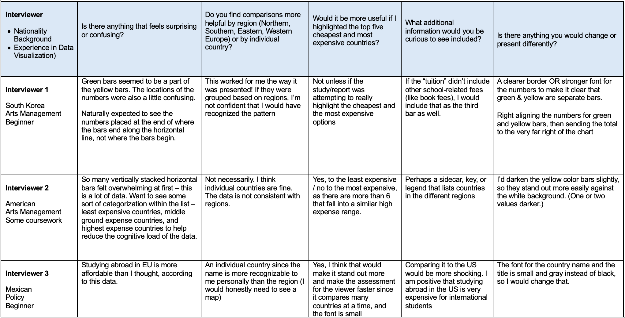
Synthesis:
Patterns in the Feedback: Overall data presentation was understandable, there are specific design choices that hinder quick interpretation. Small font size, lack of clear separation between elements, and the overwhelming number of stacked bars made it harder for viewers to grasp the key insights without extra effort. I also learned that my assumption about the usefulness of regional grouping may not hold true for my audience — participants felt more comfortable making sense of data when it was presented by individual country.
In Class Feedback: I also received feedback from classmates suggesting more detailed information on living costs (rent, utilities, transportation) and a clearer title, such as adding “The Cheapest” or “The Most Expensive” European country to study for Non-EU students. Because the chart includes many countries, its length makes comparisons difficult, especially with the top x-axis variables. Reducing the list to the top 10 most popular European countries for international students, ranked by the dataset, would make it more digestible. Finally, the contrast between the yellow and green bars is too strong, drawing attention almost entirely to the green bar and overshadowing the total yearly cost.
Step five: build the solution
For the redesign, I decided to reduce the number of countries in the dataset. I used another resource, ,Top 10 Places in Europe to Study Abroad in 2025, and focused on comparing total study costs for these top European destinations, since students are more likely to be interested in them than in other countries. In my chart, however, there are only nine countries because my original dataset did not include total cost data for Switzerland, which ranks as the second most popular study destination.
Reducing the number of countries makes the chart easier to follow and keeps the audience engaged without overwhelming detail. I also adjusted the bar colors to different shades of green, so the two variables no longer compete visually as strongly as before. I revised the title to “Nine Popular European Countries for Non-EU Students” to clearly signal the focus, rather than framing it as simply the cheapest or most expensive countries. I also added arrows to highlight the lowest and highest annual costs, drawing attention to key comparisons. For the note, I kept only the source citation rather than a long explanation, allowing the audience to click through the links to learn more about how the data was collected.
References
Finder. “The Cheapest Countries to Study in Europe.” Finder UK, July 11, 2024. https://www.finder.com/uk/current-accounts/student-bank-accounts/cheapest-countries-to-study-europe Educations.com. “Top 10 Places in Europe to Study Abroad - 2025.” Educations.com, June 17, 2025. https://www.educations.com/top-10-lists/top-10-places-to-study-abroad-europe-18099
AI acknowledgements
Using ChatGPT for grammar improvement, GitHub coding support, enhancing clarity in data visualization, and citation formatting.